Transforming a founder's concept into a scalable brand identity built for campaigns, merchandise, and community
Overview:
MOTIV8TED began with a founder's hand-drawn logo concept and a clear vision: inspire people to take action. The challenge was to preserve the meaning behind the original idea while transforming it into a professional identity system that could scale across merchandise, digital experiences, and future campaigns.
I developed a flexible brand system centered around a single iconic triangle, creating a visual language that could adapt across products, social media, and marketing without losing consistency.
The Challenge
The client had a compelling concept but no cohesive identity system. The original logo lacked the structure and flexibility needed to scale across different applications.
The new identity needed to:
The Solution
A complete identity system that centered around a single visual principle: activation through the triangle.
The logo was simplified into a clean geometric mark while custom typography and a flexible color strategy created a system that could evolve across campaigns without sacrificing brand recognition.
Brand System:

Logo System
Primary, secondary and icon lockups designed for flexibility across print, digital, and merchandise

Letterform Refinement
Custom typography refined spacing, balance, and the integration between the "V" and the "8"

The green triangle became more than a logo element—it evolved into a reusable brand device representing momentum and activation. Integrated into photography, apparel, and campaign graphics, it reinforces the brand without relying on the full logo.
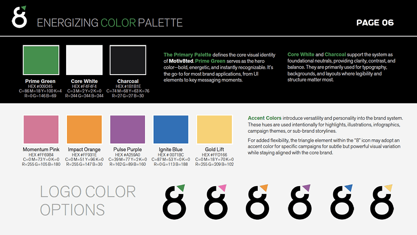
Flexible accent colors allow campaigns to evolve while maintaining recognition through the core Prime Green identity.
Brand in Action:
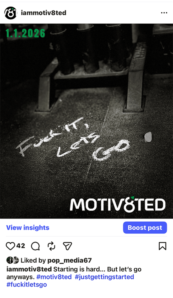
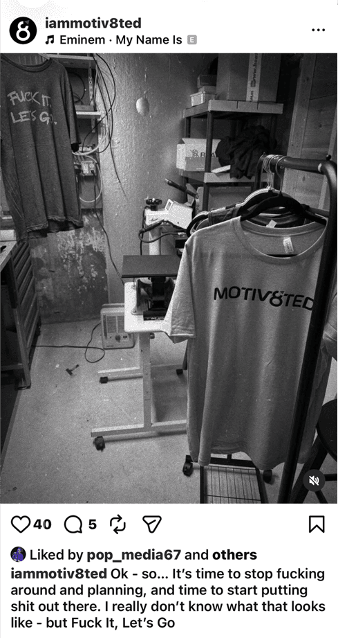
I developed a cohesive identity system that provides structure, flexibility, and consistency. Each component reinforces the brand while giving the client the freedom to grow, launch campaigns, and expand into new applications without reinventing the visual language.


Design Principles

Simplicity over complexity
Modular identity system
Campaign flexibility
Merchandise-first thinking
Consistent visual language
Results:

Created a scalable identity system for future campaigns
Developed a flexible merchandise-ready brand
Established consistent visual standards across digital and print
Delivered comprehensive brand guidelines for future growth
Designed a reusable campaign framework built around the activation triangle
Client Impact:
The final identity successfully preserved the founder's original vision while elevating it into a professional, scalable brand system.
Client feedback consistently emphasized that the redesign maintained the core idea that inspired the business while providing the clarity, flexibility, and polish needed for real-world applications. The completed brand guide generated particular enthusiasm and became a key reference for future marketing and merchandise development.
"You kept our idea, but made it look like a real brand."